calendar
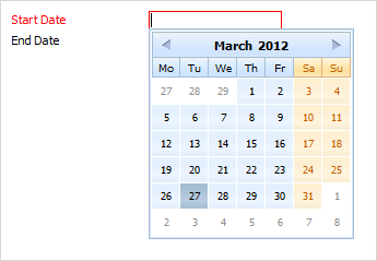
dhtmlxCalendar integration. Presents date field with pop-up calendar.
Please note, to use calendar item you must include several dhtmlxCalendar related files:
1.If you use dhtmlxCalendar standalone you need to include 6 files:
<script src="../codebase/dhtmlxcalendar.js"></script>//dhtmlxCalendar package
<link rel="stylesheet" type="text/css" href="../codebase/dhtmlxcalendar.css">//dhtmlxCalendar package
<link rel="stylesheet" type="text/css" href="../codebase/skins/dhtmlxcalendar_dhx_skyblue.css">//dhtmlxCalendar package
<script src="../codebase/ext/dhtmlxform_item_calendar.js"></script>//dhtmlxForm package
2.If you use dhtmlxCalendar as a part of 'dhtmlxSuite' package you need to have 2 files included:
<link rel="STYLESHEET" type="text/css" href="../codebase/dhtmlx.css">
<script src="../codebase/dhtmlx.js" type="text/javascript"></script>
Attributes
- calendarPosition - (bottom or right) sets the position pop-up calendar will appear from. The default value is bottom
- className - (string) the user-defined css class for item
- dateFormat - (string) sets format of date presentation in input
- inputHeight - (integer or auto) the height of input. The default value is auto
- inputLeft - (integer) sets the left absolute offset of input.Just position:“absolute” makes sense of the attribute
- inputTop - (integer) sets the top absolute offset of input. Just position:“absolute” makes sense of the attribute
- inputWidth - (integer or auto) the width of input. The default value is auto
- label - (string) the text label of item
- labelAlign - (left, right or center) the alignment of label within the defined width
- labelHeight - (integer or auto) the height of label. The default value is auto
- labelLeft - (integer) sets the left absolute offset of label. Just position:“absolute” makes sense of the attribute
- labelTop - (integer) sets the top absolute offset of label. Just position:“absolute” makes sense of the attribute
- labelWidth - (integer or auto) the width of label. The default value is auto
- name - (string) the identification name. Used for referring to item
- offsetLeft - (integer) sets the left relative offset of item (both input and label)
- offsetTop - (integer) sets the top relative offset of item (both input and label)
- enableTime - (boolean) defines whether in the bottom of calendar, time manage elements will be presented
- position - (label-left, label-right, label-top or absolute) defines the position of label relative to input
- readonly -(boolean:true/false or 0/1) specifies whether item's value can be changed by typing in the input (you are still able to set the value by clicking on the calendar icon). Can be used to exclude the possibility of entering incorrect values
- serverDateFormat - (string) the format in which the date is stored on server
- validate - (predefined rule or custom function) sets the validation rule. See details in the chapter 'Validation'
- value - (string) the initial value of item
- weekStart - (from 1 to 7) sets the start day of a week. '1' relates to Monday and '7' to Sunday.
var formData = [
		{type: "calendar", dateFormat: "%Y-%m-%d %H:%i", name: "start_date", label: "Start Date", className: "my_calendar", readonly:true},
		{type: "calendar", name: "end_date", label: "End Date"}
];