Input
Presents a standard text input field or textarea. To define textarea - use the attribute rows (see details below).
Attributes
- className - (string) the user-defined css class for item
- inputHeight - (integer or auto) the height of input. The default value is auto
- inputLeft - (integer) sets the left absolute offset of input. Just position:“absolute” makes sense of the attribute
- inputTop - (integer) sets the top absolute offset of input. Just position:“absolute” makes sense of the attribute
- inputWidth - (integer or auto) the width of input. The default value is auto
- label - (string) the text label of item
- labelAlign - (left, right or center) the alignment of label within the defined width
- labelHeight - (integer or auto) the height of DIV where the label is placed (not the font size). The default value is auto
- labelLeft - (integer) sets the left absolute offset of label. Just position:“absolute” makes sense of the attribute
- labelTop - (integer) sets the top absolute offset of label. Just position:“absolute” makes sense of the attribute
- labelWidth - (integer or auto) the width of label. The default value is auto
- maxLength - (integer) the max number of characters that can be entered in input
- name - (string) the identification name. Used for referring to item
- numberFormat - (string, array) sets the format of numeric data (see details below)
- offsetLeft - (integer) sets the left relative offset of item (both input and label)
- offsetTop - (integer) sets the top relative offset of item (both input and label)
- position - (label-left, label-right, label-top or absolute) defines the position of label relative to input
- readonly -(boolean:true/false or 0/1) specifies whether item's value can be changed by button click in browser (meanwhile, item's value can be changed programmatically anytime)
- rows - (integer) used to present textarea (instead of a single input) of the specified height (see details below)
- style - (string) specifies css style that will be applied to the input.
- validate - (predefined rule or custom function) sets the validation rule. See details in the chapter 'Validation'
- value - (string) the initial value of item
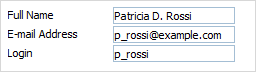
var formData = [
		{type: "input", label: "Full Name", value: "Patricia D. Rossi", position:"absolute", inputLeft:80},
		{type: "input", label: "Login", value: "p_rossi",position:"absolute", inputLeft:80, inputTop:25, labelTop:25},
		{type: "input", label: "Details", rows:3, style:"width:200px;height:200px;",position:"absolute", inputLeft:80, inputTop:50, labelTop:50}
];
'textarea' details
Generally, to turn a standard input to textarea you should set attribute rows.
Note, the attribute doesn't specify the number of rows, it specifies the initial height of the control, calculated by the formula: 35px + (rows-1)*16px . For example, rows:3 means that the height of your textarea will be 35+2*16 = 67px.
To set any random value for the height, use rows in pair with attribute style. In this case, rows can be set to any value (but it must be specified anyway!) while the style attribute must specify the desired height.
{type: "input", label: "Details", rows:3, style:"width:200px;height:200px;"}
Number formats
To set format of numeric data you should use attribute numberFormat.
For JSON data you should use the following syntax:
- numberFormat: “format”;
- numberFormat: [“format”, “groupSep”, “decSep”].
- groupSep - a mark that will be used to divide numbers with many digits into groups. By default - '.' (dot);
- decSep - a mark that will be used as the decimal delimiter. By default - ',' (comma).
formData = [
   {type: "input",  name:"inp1",  label: "Format: 0,000.00",   numberFormat: "0,000.00"},
   {type: "input",  name:"inp2",  label: "Format: @ 0,00",     numberFormat: ["@ 0,00",":"]},
   {type: "input",  name:"inp3",  label: "Format: $ 0.00",     numberFormat: ["$ 0,000.00",",","."]},
   {type: "input",  name:"inp4",  label: "Format: 0,000 Rub",  numberFormat: ["0,000 Rub","'"]}
];
In XML format you can use the following attributes:
- numberFormat=“format”;
- groupSep=“group_sep”;
- decSep=“dec_sep”.
<?xml version="1.0" encoding="UTF-8"?>
<items>
   <item type="input" label="Sales" numberFormat="$ 0,000.00" groupSep="'" decSep='.'/>
</items>
Out of the constructor, you can set the format by calling method setNumberFormat().